Is the number of stillborn piglets indicating the appearance of a PRRS outbreak?
In this article under the “Síagro use cases” section, we are going to control the evolution of a variable that measures a certain quality characteristic.
A good friend to whom we have explained the use of control charts to see the evolution of the production of his farm has asked us a very interesting question. Before sharing it, some aspects:
- We start from the premise that the PRRS modifies the number of stillborn piglets.
- Furthermore, we can study the variable “stillbirths” in different ways: stillbirths due to childbirth, total, in a given period, usually per week or like many farm management software, such as “average number of piglets stillbirths due to delivery in a certain week ”.
Our hypothesis is that the number of stillborn piglets may indicate the appearance of a PRRS outbreak. Therefore, our control variable is “stillbirths due to childbirth”.
The question: Could we see with control charts small changes in the number of stillborn piglets that would warn us that perhaps some pathological situation is changing its distribution pattern?
We had already solved various exercises with the control charts, individual, and range (x-bar-one, R). In this article, we explain what these graphs tell us. To refresh the memory, these charts can detect changes in behavior pattern in the long term, but not in the short term.
Our friend asked us: Is there a method that allows us to control the short-term variation and that works both with individual values and with group means?
The answer: Yes, with the CUSUM charts
The CUSUM (cumulative sum) charts are based on the representation of the accumulation of the deviations of each observation with respect to a reference value. The main characteristic of these types of graphs is that they detect small deviations in the data more quickly than x-bar graphs or range graphs.
These graphs were developed by Woodward and Goldsminth in 1964. This technique detects changes in the means of variables and identifies the probable moment when of the change.
CUSUM graphics are less suitable for detecting large changes, so they are complementary to the X-bar, range, and standard deviation ones, and cannot replace them. That is, we use them together. The idea that underlies these graphs is not an individual representation of values, as it could be in this case for the number of stillbirths due to childbirth (individual data) or averages thereof, but rather in the accumulation of information over time. This is why they are also called “memory graphics”.
How do we set a CUSUM chart, and how do we do it with Síagro?
Let’s continue with our friend’s question and use some data, in this case, and for didactic tasks, simulated. Suppose we have a file where we have the average number of piglets born stillborn during the last 30 weeks (where each data is the percentage of the weekly average over the total number of piglets born):
| semana (week) | muertos (deads) |
| 1 | 2,61 |
| 2 | 1,99 |
| 3 | 2,12 |
| 4 | 3,04 |
| . | . |
| . | . |
| . | . |
| 28 | 3,22 |
| 29 | 3,02 |
| 30 | 3,81 |
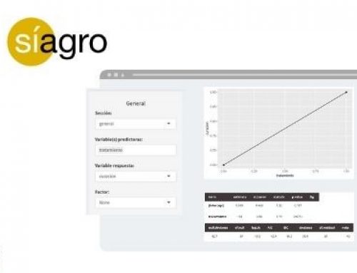
From here, we load the data file in Síagro. Within SPC in the control panel, we select our variable of interest “deads”, and the program automatically suggests (since it detects the type of variable analyzed) an X-bar graph:

The first out-of-control deviation occurred in week 25. But let’s see what a CUSUM chart tells us:

Now it is different.
This chart wants us that there is a change in the value of our variable from week 23.
If we focus on the line under the value 0, which informs us of negative deviations, we see that until week 17 the values were good (we had a few stillborn piglets). But from here on, and especially after week 23, the number of dead piglets deviates in a positive way (negative for our interests) and exceeds the control limit.
Caption:
- Number of groups = 30; data from the 30 weeks.
- Center = 2,441; the mean of the 30 weeks.
- StdDev = 0,371; standard deviation
- Decision interval (std.err.) = Control limits are set at 5 deviations from the mean.
- Shift detection (std.err.) = 1; number of standard deviations that we accept from which we want to detect deviations.
- Number beyond boundaries = 7; points beyond the limits.
Comparison of X-bar or I charts and CUSUM charts
To understand how we can use the CUSUM charts, we are going to compare them with the X-BAR or I control charts.
We have three parameters: xi, u y di:
- X1, x2, x3, … are the successive observations of the variable.
- U is the target value of the variable that we want to control. In this case, u= 2,41.
- D1, d2, d3 … are the succession of deviations of each of our values with respect to the reference mean u, that is: d1 = (x1-u) ; d2 = (x2 – u) …
So:
- With the graphs of means, we can simply see the evolution of the values with respect to the reference mean: d1, d2, d3 …
- With the CUSUM graphs, we see the succession of the data d1, d1+d2, d1+d2+d3 … that is, the first deviation of our data is added to the deviation of the second, and so on, so that each value drags information from the entire series of values and a small mismatch will accumulate until we detect it. In contrast, a small mismatch will go unnoticed on the X-Bar or I mean charts.
| Week | Piglets stillborn (xi), % | Deviation from our target value of 2,41% (di) | Accumulaion of deviations (d1, d1+d2…) |
| 1 | 2,61 | 0,20 | 0,20 |
| 2 | 1,99 | -0,42 | -0,22 |
| 3 | 2,12 | -0,29 | -0,51 |
| 4 | 3,04 | 0,63 | 0,12 |
| … | … | … | … |
* For example: If we look at week 4, the value of the accumulation of deviations is the data of the accumulation for week 3 plus the deviation of week 4, that is: -0.51 + 0.63 = 0.12.
As we have seen in the graphs, from week 17 something anomalous already happens: all the accumulations of the deviations are very positive and keep growing.
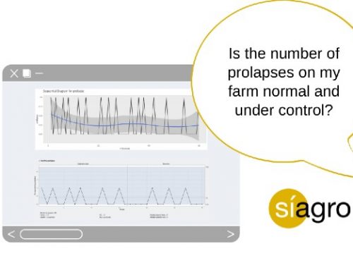
With a sequential diagram (in Exploratory Analysis in Síagro) we can also suspect:

Going back to the CUSUM graph, this graph distinguishes us between positive and negative deviations, since it is not the same for a value to deviate positively or negatively. That is, if a week or two of our data deviates in a positive way, the number of piglets increases; if it deviates negatively, it decreases.
When the line is below the value 0, it informs us of the negative deviations. It means that in the weeks where the value rises to 0, the number of dead piglets deviates in a positive way (negative for our interests) and exceeds the control limit at week 30.
The mathematics of algorithmic CUSUM
The logic that underlies the calculations and sets the graph is as follows: a K value is defined (which is chosen according to the deviation that we are going to detect, and which is usually half the standard deviation of the variable in which we are interested). From the K value, we will consider the deviation to be significant. This value will give us sensitivity to the graph. In the column of accumulated deviations, we consider that the accumulated deviation is 0 if it does not exceed this K value. Then, the graph will only inform us of the significant deviations and will also tell us if they are positive or negative, we will have a very useful graph.
We also have a value called “decision value (H)”, which is the value with which our variable is compared and is usually 5 times the standard deviation (although some authors recommend using 4 times that value).
With the H value, the decision value, and the K value, the control limits are calculated for both the negative and positive deviation graphs.