If the weaning-to-service interval decreases, do we have better fertility? Correlation and scatter plots
What is correlation?
Correlation is a statistical measure that expresses the linear relation of two. That is, if they change together constantly. Intuitively we say that two variables are correlated when there is a symmetric relation between them. We are not interested in knowing which is the dependent variable and which is the independent variable, but if there is a relation between them, as well as their meaning.
The most obvious example may be that of comparing weight and height in the human population, or in the case of pigs, daily feed consumption and daily growth.
Let’s suppose we measure the temperature of the product from which we are analyzing the loss. To see if there is a relation between both variables, we use scatter graphs, or point cloud, where each point represents the cross between the values of both variables: one on the horizontal axis and the other on the vertical axis. In the following graph we can see that when one variable increases, the other also increases.

The data is displayed as a set of points, each with the value of one variable that determines the position on the horizontal axis (x) and the value of the other variable determined by the position on the vertical axis (y).
The relation between the data sets is inferred based on the shape of the clouds, such that:
- A positive relation between x and y means that the increasing values of x are associated with the increasing values of y.
- A negative relation means that the increasing values of x are associated with the decreasing values of y.
Types of correlation
- Negative correlation: An increase in x will generate a decrease in y. The variables are produced in the opposite direction and the correlation coefficient (ρ) is between 0 and -1. When ρ is -1, the relationship is said to be perfectly negatively correlated.
- Positive correlation: An increase in y depends on an increase in x. The closer the value of ρ is to +1, the stronger the linear relation is. For example, suppose that the value of feed prices is directly related to the prices of gasoline, with a correlation coefficient of +0.95. The more expensive the transportation costs, the more expensive the purchase of the feed will be.
- Null correlation (no correlation): The graph does not follow a trend; the points are totally scattered.
For example, a negative correlation means that by increasing the % of raw material in a certain feed, the number of non-conforming products decreases. Therefore, based on this information and although we should carry out a more exhaustive analysis, we already know that we must consider using this new raw material.
Pearson’s correlations with values below 0.30 are weak, but we must also take into account whether or not they are statistically significant and their biological significance.
The following graph is a scatter diagram obtained with Síagro and represents a negative correlation between the variables: “Average end parity” and “Number of litters per female matted and year”. We also see that we get the corresponding index:

Why are there two graphs? In these graphs the independent variable is on the X axis and the dependent variable on the Y axis. But, as we said, in the case of correlation there is no dependency relation: we measure it in two directions. Thus, we obtain two graphs.
Case of use 1: Correlation of four variables: average of total born piglets, percentage of fertility at farrowing, percentage of covered sows, mean of the weaning-heat interval
We are going to use a database that includes information on the weekly average results of a sow farm from 2008 to 2011. The variables that the file has are:
- Id: identificator.
- date: date.
- avg_totalborn: average of total born piglets.
- fertility: percentage of fertility at farrowing during that week.
- cedttcub: percentage of sows covered during the corresponding week of mating seven or fewer days after weaning.
- idc: mean of the weaning-to-service interva during that week.
Summary of the database we have used for the analysis:
| id | date | avg_totalborn | fertility | cerdttcub | idc |
| 1 | 01/01/2008 | 13,16 | 54,6 | 76,47 | 11,7 |
| 2 | 08/01/2008 | 13,27 | 54,79 | 81,42 | 10 |
| 3 | 15/01/2008 | 13,65 | 74,3 | 87,76 | 9,1 |
| 4 | 22/01/2008 | 13,32 | 67,53 | 78,12 | 8,2 |
| 5 | 29/01/2008 | 12,97 | 70,75 | 79,81 | 8,3 |
| 6 | 05/02/2008 | 13,3 | 68,33 | 81,98 | 8,1 |
| . | . | . | . | . | . |
| . | . | . | . | . | . |
| . | . | . | . | ||
| 208 | 19/12/2011 | 13,24 | 78,22 | 93,08 | 6,2 |
| 209 | 26/12/2011 | 13,35 | 75,49 | 92,55 | 6,8 |
The questions we want to answer using this data are the following:
- “fertility” and “cerdttcub”: that is, if we cover more sows in the seven days after weaning, do we have higher fertility?
- “fertility” and “avg_totalborn”: if we have higher fertility, do we have more total born piglets?
- “fertility” and “idc”: if the interval from weaning to heat is shorter, do we have better fertility?
- “avg_totalborn” and “cerdttcub”: if we cover more sows in the seven days after weaning, do we have more total born piglets?
- “avg_totalborn” and “idc”: if the interval from weaning to heat is shorter, do we have more total born?
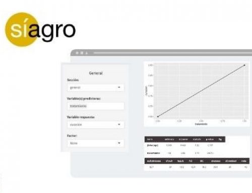
To study the relation between the variables above, we could select each of the previous relations and create a scatter plot for each combination. But … could we see all relations in a single graph? Síagro allows us to make all these crosses in a single graph and visualize it in a scatter graph, also with the correlation statistic.
We just have to go to EDA / Pairs in the program and select all our variables in the control panel. We will obtain the following:

From the previous graph and the correlation statistic (which confirms or not the relation and meaning of the variables, as we have seen), we can draw the first conclusions.
If we look at the different tables, it can be stated that:
- There is a statistically significant correlation (p <0.05) between “cerdttcub” and “idc” (high and negative, -0.874, which would indicate that increasing “cerdttcub” decreases “idc”), and between “avg_totalborn” and “ idc ”(also negative, -0.139, but of a lesser magnitude)
- It is suspected that there may be a relation (0.05 <p <0.10) between “cerdttcub” and “fertility” (+ 0.115), and between “avg_totalborn” and “fertility” (+0.122);
- The rest of the correlations (p ≥ 0.10) cannot be considered statistically significant, with which we accept that there is no correlation between them.
The points of the graphs visually show us the sense of the relation and with the correlation data we give it value. The p-value tells us whether or not the previous relation is statistically significant, and it is up to us to give more or less value to the previous data.
Thus, in response to the previous questions:
- If we cover more sows in the seven days after weaning, do we have higher fertility? Yes, but it is not very important and it only has a statistical trend.
- If we have higher fertility, do we have more total born piglets? Yes, but it is not very important and it only has a statistical trend.
- If the weaning to heat interval is shorter, do we have better fertility? No, the correlation is low and not statistically different from 0.
- If we cover more sows in the seven days after weaning, do we have more total born piglets? No, the correlation is low and not statistically different from 0.
- If the interval from weaning to heat is shorter, do we have more total born? Yes, and it is statistically significant, although it is not very relevant.
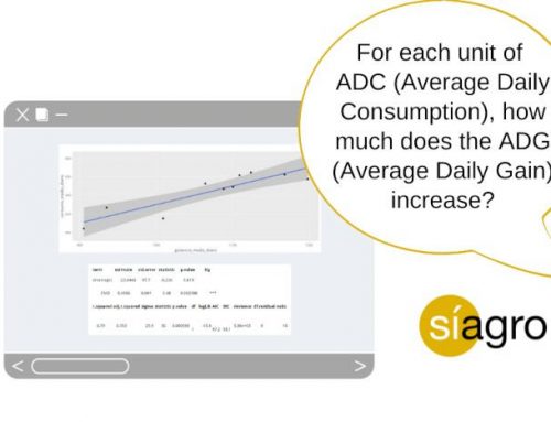
Case of use 2: Correlation of three variables: pig, ADG (Average Daily Gain) and ADC (Average Daily Consumption)
To obtain the following graphs, we have used this database, which includes three variables:
- Pigs: Every observation
- ADG: Average Daily Gain (ganancia_media_diaria)
- ADC: Average Daily Consumption (consumo_medio_diario)
| pig | ADC | ADG |
| 1 | 1064 | 532 |
| 2 | 1168 | 556 |
| 3 | 905 | 411 |
| 4 | 1124 | 562 |
| 5 | 1100 | 523 |
| 6 | 1198 | 544 |
| 7 | 935 | 467 |
| 8 | 1088 | 518 |
| 9 | 1109 | 554 |
| 10 | 1009 | 438 |
Following the steps explained in the previous example, we select both variables and get this graph:

In this case, the graph provides a very visual idea of how the two variables are related, as well as the numerical value of the correlation statistic of both variables (0.889) that indicates that there is a linear and positive association.
The scatter diagram can study the relationship between[1]:
- Two factors or causes related to quality.
- Two quality problems.
- A quality problem and its possible cause.
- As many variables as we need to improve our results.
[1] Fuente: AEC
Access the Official Website of Síagro to obtain more information on how your company can benefit from data-driven decisions, and why you have just found your best statistical ally.